Launch Control
Overview
Challenge
Problem: When I joined the team, the platform was already a success story with a large user base. This happened in just a few years, development was rapid, and the team was growing fast. This led to significant design debt. There was no clear design direction, and many screens had completely different styles. UX was suffering, which was visible in retention rates and the number of support tickets.
Constraints: While the work of improving visual clarity was being done, rapid development of the platform had to continue, so the design team was usually stretched across multiple parallel projects. Another major constraint was complying with government regulations related to the real estate market. It was clear that something had to be done with the design, but the founder wanted to preserve the key aesthetics of the existing platform.
Approach
Research: the company already had well-developed Customer Support and Customer Success departments that collected data regarding user retention, churn, pain points, and difficult onboarding steps. Some long-term users even created detailed videos describing frustrating parts of the platform.
Key insights: all issues reported by users and confirmed by the data pointed to the same conclusion:
the platform was not following basic heuristic principles. Most user needs were already covered by the platform, but features were often not intuitive enough or were difficult to find.
One key feature users were expressing interest was better campaign management, the feature did exist at that time but had limited capabilities. Users demanded auto response, statistics and automations.
Design decisions:
Conduct a full platform audit and collected all versions and variations of components (buttons, input fields, modals, tables, etc.) so that we could evaluate them and get a clear picture of the scale of the design debt.
Create new design system that would solve a lot of confusion. Do a thorough competitor analysis, take into account all the user input and develop the feature.
Solution
UX approach to a new campaign feature:
UX flow was developed through 4 key steps, each step was going more in dept:
Competitor analysis
We scanned through 20 top SMS marketing apps and decided to pick 6 most relevant for our case. I went trough all available public data about all of them and created LoFi UX flows, so that the team can easily understand how they work and be able to discuss it.
(IMAGE of competitton workflows)
LoFi UX flow chart: gives birds eye perspective of general approach to the feature. It was useful for setting key concepts and developers could give technical assessment and rough time estimate for development.
(LoFI IMAGE)
HiFi UX flow: gives more detailed picture, covers error and edge cases, defines information architecture. This allowed design team to evaluate if we covered all user needs we decided to focused on. Developers were able to give more detailed estimation for their work.
(HiFi UX flow IMAGE)
HiFi wireframe UX flow: usually this is the final step where we have covered all possible details (modals, tooltips, states…) and final screen designs would be used. But since the new design system was developing in parallel to this feature I used HiFi wireframes.
Final designs: here you can see final design of the screens once the new design system was developed.
(SLIDER WITH FINAL SCREENS)
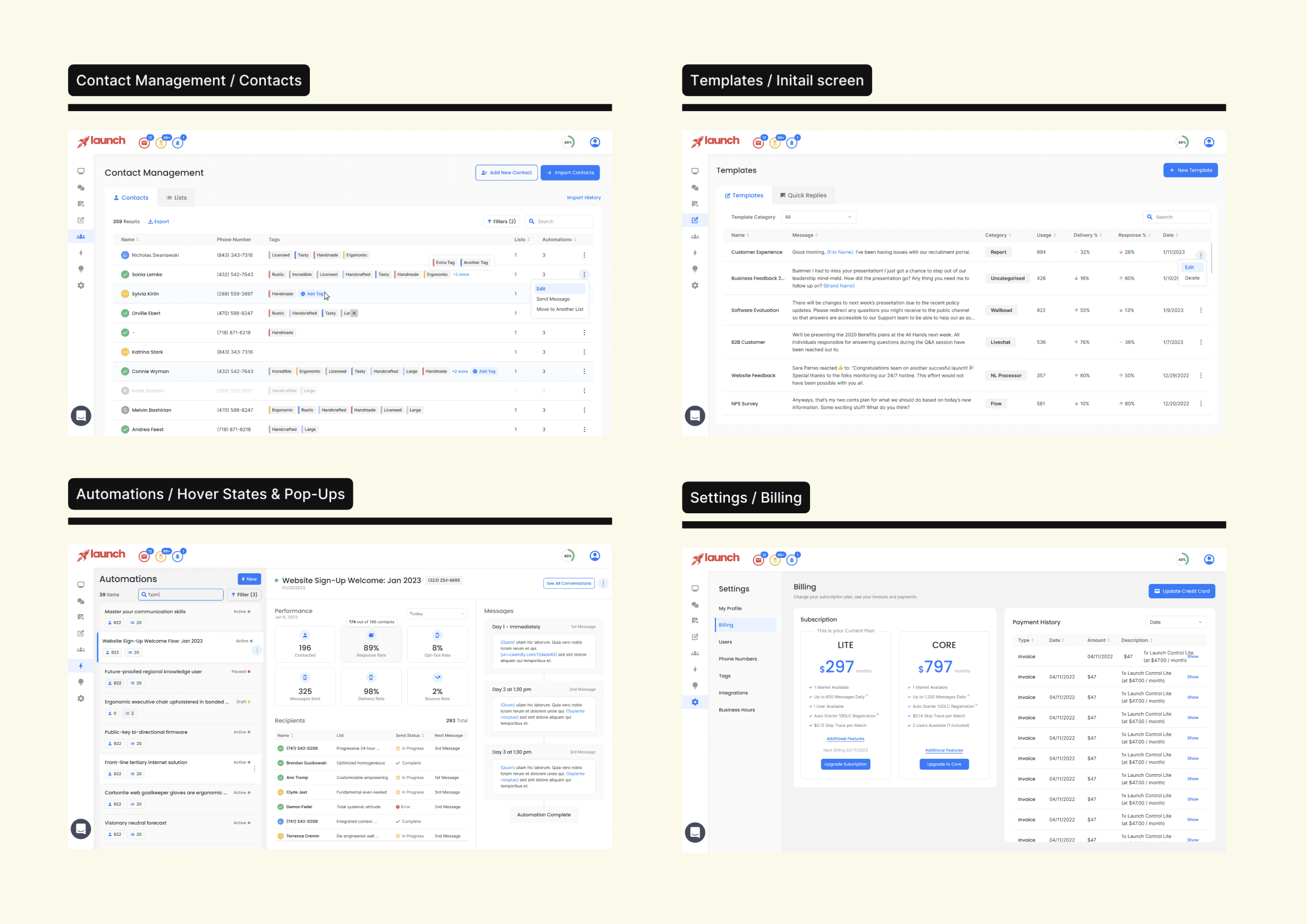
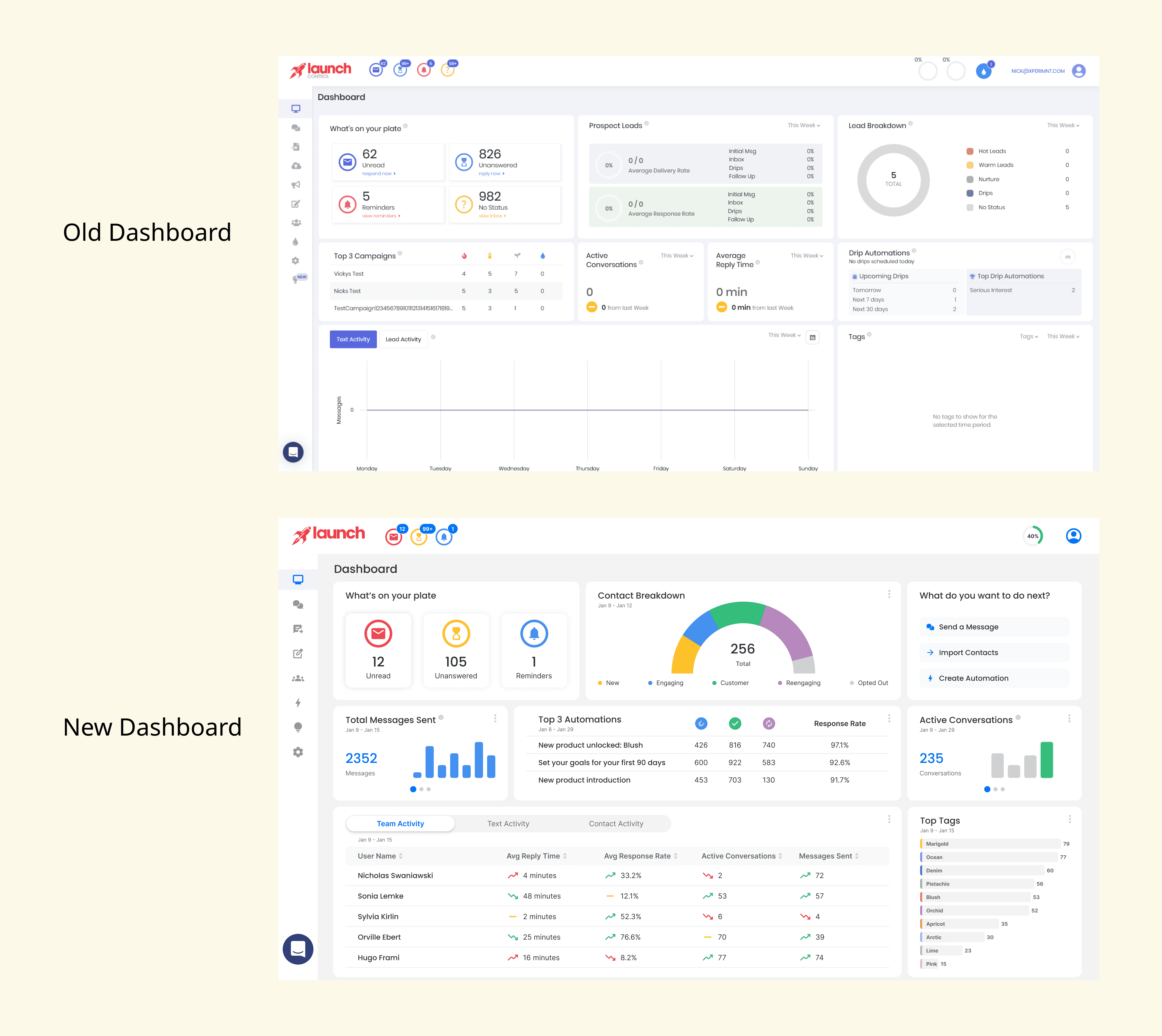
Design system: Although there was little consistency across the platform, after the full audit we identified a number of elements that could serve as a foundation for a new design system. As a result, the new design system felt like a cleaner, more polished evolution of the product rather than a complete redesign. Dashboard had the most dramatic redesign, it was recreated from the ground up based on research and user input.
(SPLIT VIEW komponenta)
Design system has defined colors, typography, effects and all components needed for designing full platform.
(3 IMAGES iz dizajn sistema, plus dugme See full design system)
Impact
Results For Users:
Improved visual consistency made the platform easier to learn and navigate which made onboarding new customers easier.
More consistent interaction patterns reduced the cognitive load required to move between different parts of the platform, churn went down and user retention got better.
Key actions became easier to discover, reducing frustration caused by hidden or difficult-to-find functionality.
Existing users were able to benefit from UX improvements without having to relearn the product due to a drastic redesign - new design system was well received.
By using updated campaign feature users managed to get higher conversion rates.
Reduced time needed to create and launch campaigns by automating setup, targeting, and scheduling steps.
Lessons learned:
Customer support and customer success teams can be one of the most valuable sources of UX research in established products.
Preserving familiarity can be just as important as introducing improvements, especially for products with a large existing user base.
Design systems are not only a visual tool but also a way to manage complexity across fast-growing teams.