





Overview
Product
CheckIT Labs is a multi-product company consisting of 6 different products, covering HR, medical, utility, educational and IT sectors. The platform CheckIT Learning is a combination of Learning Management System (LMS) and Student Information System (SIS). It means that it covers all the needs of a typical modern school or university. The platform was made for diverse markets covering multiple continents.
Role
I worked on a CheckIT Learning platform as a UX/UI designer in a design team of 3 people. I worked on the learning platform as a UI/UX designer but I also did branding and design system for all the products. I collaborated with product, development and marketing teams.
Duration
Project lasted 24 months.
Challenge
Problem
When I arrived at the company there was only one designer in the team, and all design was created in Adobe XD - already back than discontinued software. There was no design system in place, the platform lacked consistency in some areas and made the design work slower. Design workflow between developers and designers needed to be restructured. So the first task was to convert XD files to Figma, mostly done by hand since conversion plugins didn't provide optimal results. Next task was to create clear structure of new files and naming standards that follow development cycles.

Once the main bottleneck in a workflow was dealt with, the design team was able to focus on the product challenges. At this point the product was already 2 years old and founders realized late in the game that their original approach needed to be redesigned almost from the ground up, since the existing product didn’t work well on the market. At the same time when I arrived new learning specialists was introduced to help with this transition. Together we created a Low-Fi UX workflow of the ideal platform and pinpointed main topics that needed to be researched to fill the gaps. What helped us a lot was that we did a competitive analysis and we did preliminary interviews with other learning specialists.
Constrains
Since there was already a lot of code done the main constraint was to use as much existing code and design into the new platform. We had to keep scope doable and fit into the project time frame. So there was constant negotiation on the 3 questions:
Can we justuse what we have?
Can we tweak what we have?
Do we need to start from the scratch?
Approach
General approach
Since the main issue in the design process of the previous platform was lack of research and testing with customers we decided to actually do that. There were many initiatives covering different aspects of the platform for all the user roles, but in this case study I will focus on teachers since they use the app most out of the mentioned roles.
Research
We designed a research for 15 teachers in 2 phases. In the first phase we did a workshop where we figured out what the main pain points in their work were, how does that relate to our platform and how we can improve it. In the second phase we did individual interviews where we shadowed them in their daily computer work with the idea to figure out if there was something left out in the workshops and to get a better understanding of their work.
Key insights
The main issue with the existing solutions teachers face were: constant app switching, lack of integration between the apps, big amount of time during the week was spent on the mundane administrative tasks which took them time and energy from the students and teaching. Some of the issues were trivial UX problems, some were on the system level lack of features.

When creating lectures, teachers had problems with easily assigning students in groups. The process was so convoluted and involved multiple modals that they found easier to assign each student one by one, since the students were not organized in the fashion they needed.
















All teachers were complaining that they needed to use many different apps over the day in order to finish simple tasks. One teacher had 22 different apps, almost every job was a separate app. What added complexity was that they were poorly integrated, so teachers had to copy-paste the same data in multiple places. For example curriculum app was not connected with reporting app, so in the reports they manually had to input names of their lessons.
Design Decision
We decided that we need to streamline the whole teacher-student workflow and cover all main needs in one integrated platform solution with a special care to user experience.
Solution
General approach
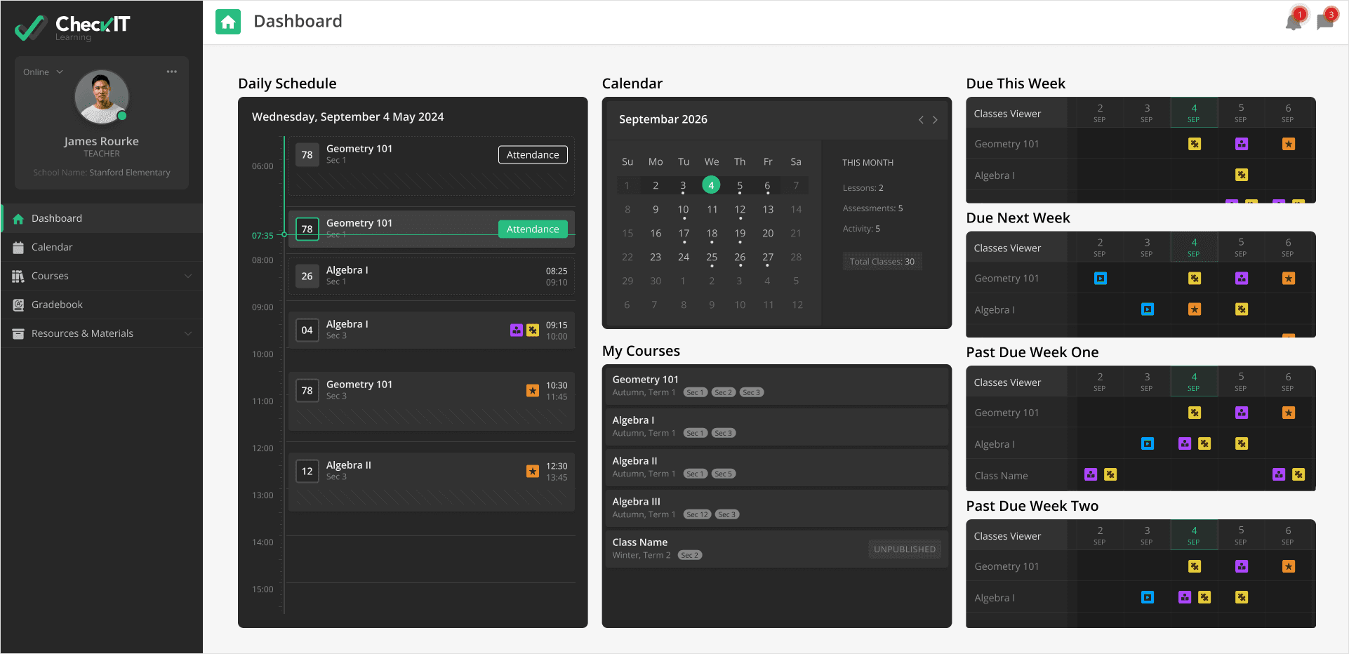
We created simple navigation where features were logically grouped. All teachers needs were covered in one integrated solution.
" height="14.875px" id="w5BOckeuy" transform="translate(3 4)" width="17.5px"/></svg>)
" height="17.5px" id="NGgqfstay" transform="translate(4 3)" width="15px"/></svg>)
" height="17.500530241180943px" id="DktDf5aT7" transform="translate(3 3)" width="17.500522493926162px"/></svg>)
" height="17.49998888888889px" id="ojkjbbm_J" transform="translate(4 3)" width="15.253599999999999px"/></svg>)
" height="14.999999857940674px" id="NrUCPLK1R" transform="translate(3 4)" width="17.5px"/></svg>)
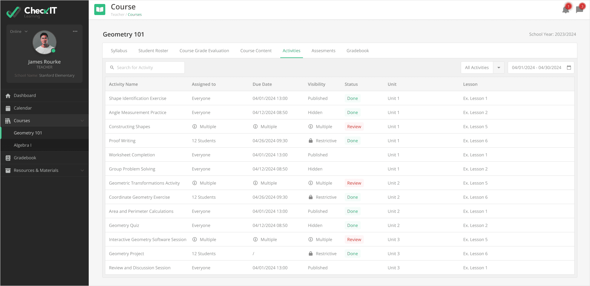
Here are screens made in transitional design system showing: dashboard, course content, activities, course grade evaluation, student roster, and calendar.


Important interactions
Here you can see design tackling assigning issue teachers were facing. Teacher can choose 3 assigning options: everyone (select all students available for the content type), sections (select specific sections of students) and individual students (allows filtering, sorting, batch selection of students). Everything is reachable from one dialog.

Branding and a transitional design system
When I arrived there was no design system but there was a visual language, colors, and typography in place, but it wasn’t always consistent and in some cases same UX patterns were using different approaches. It was also clear that CheckIT had other products that could benefit the same design system with custom theming. Since redesigning a whole platform went against the idea of reusing existing code, we had a transitioning design system first and later I did a completely new design system. For the transitional design system we took all the existing components, audited them, simplified them and made clear color and typography styles. What was possible to do without any refactoring is branding, so I designed all the logos of the products under CheckIT Labs umbrella. Click here to see all variations of logos in Figma.





CheckIT Design System 2.0
Once it was the right time for the team I made a completely new design system that can be used for all the products. It had to follow WCAG accessibility standards (something that was brought up on several occasions in the research), support easy themeing (needed for different brands and dark/light interface, requested by many users), and support large desktop monitors (used by administration and teachers) and small notebook devices (used by students). To achieve this I used design tokens and collaborated with developers in order to be on the same page and make sure that designers software (Figma) and code base used by front end had the same values and have the same look and feel.


Top image is Transitional design system and bottom is the Design System 2.0. New design system have more components, clear design language, color pallet with sufficient contrasts between foreground and background elements, and clear typography structure.


Since everything is defined by color, typography and spacing tokens making new themes is trivial for designers and developers. Here you can compare White VS Contrast Black themes.
Impact
Results For Users
" width="36px"><path d="M 3 36 C 2.2 36 1.5 35.7 0.9 35.1 C 0.3 34.5 0 33.8 0 33 L 0 3 C 0 2.2 0.3 1.5 0.9 0.9 C 1.5 0.3 2.2 0 3 0 L 33 0 C 33.8 0 34.5 0.3 35.1 0.9 C 35.7 1.5 36 2.2 36 3 L 36 33 C 36 33.8 35.7 34.5 35.1 35.1 C 34.5 35.7 33.8 36 33 36 Z M 3 33 L 16.5 33 L 16.5 3 L 3 3 Z M 19.5 33 L 33 33 L 33 17.95 L 19.5 17.95 Z M 19.5 14.95 L 33 14.95 L 33 3 L 19.5 3 Z" fill="rgb(28, 27, 31)" height="36px" id="C_hI0V9zu" width="36px"/></g></svg>)
Teachers experienced a more unified workflow by reducing the need to switch between multiple disconnected tools.
" height="46px" id="OM1Cdk2LQ" width="48px"/></g></svg>)
Administrative tasks such as grading, attendance, and course management became more centralized, reducing manual duplication of work.
" width="36px"><path d="M 15.15 25.25 L 10.15 20.25 C 9.85 19.95 9.5 19.8 9.1 19.8 C 8.7 19.8 8.35 19.95 8.05 20.25 C 7.75 20.55 7.608 20.9 7.625 21.3 C 7.642 21.7 7.783 22.05 8.05 22.35 L 14.1 28.5 C 14.4 28.8 14.75 28.95 15.15 28.95 C 15.55 28.95 15.9 28.8 16.2 28.5 L 27.95 16.75 C 28.25 16.45 28.4 16.092 28.4 15.675 C 28.4 15.258 28.25 14.9 27.95 14.6 C 27.65 14.3 27.292 14.15 26.875 14.15 C 26.458 14.15 26.1 14.3 25.8 14.6 Z M 3 40 C 2.175 40 1.469 39.706 0.881 39.118 C 0.294 38.531 0 37.825 0 37 L 0 7 C 0 6.175 0.294 5.469 0.881 4.881 C 1.469 4.294 2.175 4 3 4 L 13.25 4 C 13.417 2.833 13.95 1.875 14.85 1.125 C 15.75 0.375 16.8 0 18 0 C 19.2 0 20.25 0.375 21.15 1.125 C 22.05 1.875 22.583 2.833 22.75 4 L 33 4 C 33.825 4 34.531 4.294 35.119 4.881 C 35.706 5.469 36 6.175 36 7 L 36 37 C 36 37.825 35.706 38.531 35.119 39.118 C 34.531 39.706 33.825 40 33 40 Z M 3 37 L 33 37 L 33 7 L 3 7 Z M 19.225 5.625 C 19.575 5.275 19.75 4.867 19.75 4.4 C 19.75 3.933 19.575 3.525 19.225 3.175 C 18.875 2.825 18.467 2.65 18 2.65 C 17.533 2.65 17.125 2.825 16.775 3.175 C 16.425 3.525 16.25 3.933 16.25 4.4 C 16.25 4.867 16.425 5.275 16.775 5.625 C 17.125 5.975 17.533 6.15 18 6.15 C 18.467 6.15 18.875 5.975 19.225 5.625 Z" fill="rgb(28, 27, 31)" height="40px" id="egNM83g4r" width="36px"/></g></svg>)
The new student selection feature made it easier for teachers to organize students into meaningful groups, improving how they distribute and delivered lectures.
" width="40px"><path d="M 3 32 C 2.2 32 1.5 31.7 0.9 31.1 C 0.3 30.5 0 29.8 0 29 L 0 3 C 0 2.2 0.3 1.5 0.9 0.9 C 1.5 0.3 2.2 0 3 0 L 37 0 C 37.8 0 38.5 0.3 39.1 0.9 C 39.7 1.5 40 2.2 40 3 L 40 29 C 40 29.8 39.7 30.5 39.1 31.1 C 38.5 31.7 37.8 32 37 32 Z M 3 29 L 37 29 L 37 7.2 L 3 7.2 Z M 17.9 20 L 25.2 12.7 C 25.504 12.4 25.872 12.25 26.303 12.25 C 26.734 12.25 27.1 12.402 27.4 12.705 C 27.7 13.009 27.85 13.375 27.85 13.805 C 27.85 14.235 27.7 14.6 27.4 14.9 L 18.95 23.35 C 18.65 23.65 18.3 23.8 17.9 23.8 C 17.5 23.8 17.15 23.65 16.85 23.35 L 12.6 19.1 C 12.3 18.796 12.15 18.428 12.15 17.997 C 12.15 17.566 12.302 17.2 12.605 16.9 C 12.909 16.6 13.275 16.45 13.705 16.45 C 14.135 16.45 14.5 16.6 14.8 16.9 Z" fill="rgb(28, 27, 31)" height="32px" id="zoOha2lhN" width="40px"/></g></svg>)
Overall, the platform became more predictable and consistent, reducing confusion caused by previously fragmented UI patterns.
Results for the team
" width="40.79999px"><path d="M 3 36 C 2.2 36 1.5 35.7 0.9 35.1 C 0.3 34.5 0 33.8 0 33 L 0 3 C 0 2.2 0.3 1.5 0.9 0.9 C 1.5 0.3 2.2 0 3 0 L 37.8 0 C 38.6 0 39.3 0.3 39.9 0.9 C 40.5 1.5 40.8 2.2 40.8 3 L 40.8 33 C 40.8 33.8 40.5 34.5 39.9 35.1 C 39.3 35.7 38.6 36 37.8 36 Z M 3 33 L 37.8 33 L 37.8 3 L 3 3 Z M 14.4 28 C 14.967 28 15.442 27.808 15.825 27.425 C 16.208 27.042 16.4 26.567 16.4 26 C 16.4 25.433 16.208 24.958 15.825 24.575 C 15.442 24.192 14.967 24 14.4 24 L 8.4 24 C 7.833 24 7.358 24.192 6.975 24.575 C 6.592 24.958 6.4 25.433 6.4 26 C 6.4 26.567 6.592 27.042 6.975 27.425 C 7.358 27.808 7.833 28 8.4 28 Z M 25.5 18.35 L 24.05 16.9 C 23.65 16.5 23.183 16.308 22.65 16.325 C 22.117 16.342 21.65 16.55 21.25 16.95 C 20.883 17.35 20.692 17.817 20.675 18.35 C 20.658 18.883 20.85 19.35 21.25 19.75 L 24.45 22.95 C 24.75 23.25 25.1 23.4 25.5 23.4 C 25.9 23.4 26.25 23.25 26.55 22.95 L 34 15.5 C 34.4 15.1 34.6 14.633 34.6 14.1 C 34.6 13.567 34.4 13.1 34 12.7 C 33.6 12.3 33.125 12.1 32.575 12.1 C 32.025 12.1 31.55 12.3 31.15 12.7 Z M 14.4 20 C 14.967 20 15.442 19.808 15.825 19.425 C 16.208 19.042 16.4 18.567 16.4 18 C 16.4 17.433 16.208 16.958 15.825 16.575 C 15.442 16.192 14.967 16 14.4 16 L 8.4 16 C 7.833 16 7.358 16.192 6.975 16.575 C 6.592 16.958 6.4 17.433 6.4 18 C 6.4 18.567 6.592 19.042 6.975 19.425 C 7.358 19.808 7.833 20 8.4 20 Z M 14.4 12 C 14.967 12 15.442 11.808 15.825 11.425 C 16.208 11.042 16.4 10.567 16.4 10 C 16.4 9.433 16.208 8.958 15.825 8.575 C 15.442 8.192 14.967 8 14.4 8 L 8.4 8 C 7.833 8 7.358 8.192 6.975 8.575 C 6.592 8.958 6.4 9.433 6.4 10 C 6.4 10.567 6.592 11.042 6.975 11.425 C 7.358 11.808 7.833 12 8.4 12 Z" fill="rgb(28, 27, 31)" height="36px" id="SF4zdKtjH" width="40.79999px"/></g></svg>)
The introduction of user research shifted the design process from assumption-driven to evidence-based product development.
" width="35.28002208863788px"><path d="M 17.64 42 C 17.64 37.9 19.065 34.15 21.915 30.75 C 24.765 27.35 28.173 25.233 32.14 24.4 C 32.607 24.3 33.065 24.292 33.515 24.375 C 33.965 24.458 34.34 24.683 34.64 25.05 C 34.973 25.417 35.173 25.825 35.24 26.275 C 35.307 26.725 35.29 27.183 35.19 27.65 C 34.323 31.583 32.19 34.958 28.79 37.775 C 25.39 40.592 21.673 42 17.64 42 Z M 21.39 38.25 C 24.057 37.383 26.273 36.067 28.04 34.3 C 29.807 32.533 31.123 30.317 31.99 27.65 C 29.323 28.517 27.107 29.842 25.34 31.625 C 23.573 33.408 22.257 35.617 21.39 38.25 Z M 17.64 42 C 17.64 37.9 16.215 34.15 13.365 30.75 C 10.515 27.35 7.107 25.233 3.14 24.4 C 2.673 24.3 2.215 24.292 1.765 24.375 C 1.315 24.458 0.94 24.683 0.64 25.05 C 0.307 25.417 0.107 25.833 0.04 26.3 C -0.027 26.767 -0.01 27.233 0.09 27.7 C 0.957 31.633 3.09 35 6.49 37.8 C 9.89 40.6 13.607 42 17.64 42 Z M 13.89 38.25 C 11.223 37.383 9.007 36.067 7.24 34.3 C 5.473 32.533 4.157 30.317 3.29 27.65 C 5.957 28.517 8.173 29.842 9.94 31.625 C 11.707 33.408 13.023 35.617 13.89 38.25 Z M 17.665 16 C 18.348 16 18.932 15.75 19.415 15.25 C 19.898 14.75 20.14 14.158 20.14 13.475 C 20.14 12.792 19.901 12.208 19.422 11.725 C 18.942 11.242 18.348 11 17.64 11 C 16.973 11 16.39 11.239 15.89 11.719 C 15.39 12.198 15.14 12.792 15.14 13.5 C 15.14 14.167 15.39 14.75 15.89 15.25 C 16.39 15.75 16.982 16 17.665 16 Z M 14.357 25.925 C 13.379 25.208 12.657 24.267 12.19 23.1 C 11.99 23.1 11.782 23.108 11.565 23.125 C 11.348 23.142 11.14 23.15 10.94 23.15 C 9.344 23.15 7.979 22.582 6.843 21.447 C 5.708 20.311 5.14 18.946 5.14 17.35 C 5.14 16.683 5.273 16.025 5.54 15.375 C 5.807 14.725 6.19 14.1 6.69 13.5 C 6.223 12.9 5.857 12.275 5.59 11.625 C 5.323 10.975 5.19 10.324 5.19 9.672 C 5.19 8.057 5.75 6.683 6.869 5.55 C 7.988 4.417 9.345 3.85 10.94 3.85 C 11.14 3.85 11.348 3.858 11.565 3.875 C 11.782 3.892 11.99 3.9 12.19 3.9 C 12.657 2.733 13.379 1.792 14.357 1.075 C 15.335 0.358 16.429 0 17.64 0 C 18.851 0 19.945 0.358 20.923 1.075 C 21.901 1.792 22.623 2.733 23.09 3.9 C 23.29 3.9 23.498 3.892 23.715 3.875 C 23.932 3.858 24.14 3.85 24.34 3.85 C 25.935 3.85 27.292 4.418 28.411 5.553 C 29.53 6.689 30.09 8.054 30.09 9.65 C 30.09 10.317 29.965 10.975 29.715 11.625 C 29.465 12.275 29.09 12.9 28.59 13.5 C 29.057 14.1 29.423 14.725 29.69 15.375 C 29.957 16.025 30.09 16.676 30.09 17.328 C 30.09 18.943 29.53 20.317 28.411 21.45 C 27.292 22.583 25.935 23.15 24.34 23.15 C 24.14 23.15 23.932 23.142 23.715 23.125 C 23.498 23.108 23.29 23.1 23.09 23.1 C 22.623 24.267 21.901 25.208 20.923 25.925 C 19.945 26.642 18.851 27 17.64 27 C 16.429 27 15.335 26.642 14.357 25.925 Z M 24.35 20.15 C 25.11 20.15 25.765 19.876 26.315 19.329 C 26.865 18.781 27.14 18.122 27.14 17.351 C 27.14 16.784 26.99 16.292 26.69 15.875 C 26.39 15.458 25.99 15.117 25.49 14.85 L 23.14 13.7 C 23.073 14.167 22.973 14.608 22.84 15.025 C 22.707 15.442 22.539 15.835 22.338 16.206 C 22.137 16.577 21.895 16.927 21.613 17.256 C 21.331 17.585 21.007 17.883 20.64 18.15 L 22.759 19.64 C 22.98 19.813 23.22 19.942 23.48 20.025 C 23.74 20.108 24.03 20.15 24.35 20.15 Z M 23.14 13.3 L 25.49 12.15 C 25.99 11.883 26.382 11.529 26.665 11.088 C 26.948 10.647 27.09 10.165 27.09 9.643 C 27.09 8.881 26.825 8.225 26.296 7.675 C 25.766 7.125 25.114 6.85 24.34 6.85 C 24.04 6.85 23.762 6.892 23.507 6.975 C 23.251 7.058 22.996 7.183 22.74 7.35 L 20.54 8.85 C 20.907 9.117 21.24 9.41 21.54 9.73 C 21.84 10.05 22.09 10.39 22.29 10.75 C 22.523 11.117 22.707 11.508 22.84 11.925 C 22.973 12.342 23.073 12.8 23.14 13.3 Z M 15.19 8.6 C 15.657 8.4 16.098 8.25 16.515 8.15 C 16.932 8.05 17.307 8 17.64 8 C 17.973 8 18.348 8.05 18.765 8.15 C 19.182 8.25 19.623 8.4 20.09 8.6 L 20.44 5.5 C 20.507 4.8 20.24 4.208 19.64 3.725 C 19.04 3.242 18.382 3 17.665 3 C 16.948 3 16.282 3.246 15.665 3.739 C 15.048 4.231 14.773 4.818 14.84 5.5 Z M 17.665 24 C 18.382 24 19.04 23.758 19.64 23.275 C 20.24 22.792 20.507 22.2 20.44 21.5 L 20.09 18.4 C 19.623 18.6 19.182 18.75 18.765 18.85 C 18.348 18.95 17.973 19 17.64 19 C 17.307 19 16.932 18.95 16.515 18.85 C 16.098 18.75 15.657 18.6 15.19 18.4 L 14.84 21.5 C 14.773 22.182 15.048 22.769 15.665 23.261 C 16.282 23.754 16.948 24 17.665 24 Z M 12.14 13.3 C 12.207 12.8 12.307 12.342 12.44 11.925 C 12.573 11.508 12.741 11.119 12.942 10.757 C 13.143 10.395 13.385 10.054 13.667 9.732 C 13.949 9.411 14.273 9.117 14.64 8.85 L 12.521 7.359 C 12.3 7.186 12.06 7.058 11.8 6.975 C 11.54 6.892 11.25 6.85 10.93 6.85 C 10.17 6.85 9.515 7.124 8.965 7.673 C 8.415 8.223 8.14 8.884 8.14 9.657 C 8.14 10.186 8.29 10.667 8.59 11.1 C 8.89 11.533 9.29 11.883 9.79 12.15 Z M 10.94 20.1 C 11.24 20.1 11.515 20.058 11.765 19.975 C 12.015 19.892 12.273 19.767 12.54 19.6 L 14.74 18.15 C 14.373 17.883 14.04 17.589 13.74 17.267 C 13.44 16.946 13.19 16.604 12.99 16.242 C 12.79 15.881 12.617 15.481 12.47 15.043 C 12.323 14.606 12.213 14.158 12.14 13.7 L 9.79 14.85 C 9.29 15.117 8.898 15.471 8.615 15.912 C 8.332 16.353 8.19 16.835 8.19 17.356 C 8.223 18.119 8.496 18.767 9.007 19.3 C 9.518 19.833 10.163 20.1 10.94 20.1 Z" fill="rgb(28, 27, 31)" height="42px" id="TF8A9I8r9" width="35.28002208863788px"/></g></svg>)
The transition design system improved consistency across existing products while allowing the team to continue development without a full rebuild.
" width="40px"><path d="M 0 29.75 L 0 10.55 C 0 9.925 0.219 9.394 0.657 8.956 C 1.094 8.519 1.625 8.3 2.25 8.3 L 6.15 8.3 L 6.15 2.25 C 6.15 1.625 6.369 1.094 6.806 0.656 C 7.244 0.219 7.775 0 8.4 0 L 15.15 0 C 15.775 0 16.306 0.219 16.744 0.656 C 17.181 1.094 17.4 1.625 17.4 2.25 L 17.4 8.3 L 22.6 8.3 L 22.6 2.25 C 22.6 1.625 22.819 1.094 23.256 0.656 C 23.694 0.219 24.225 0 24.85 0 L 31.6 0 C 32.225 0 32.756 0.219 33.194 0.656 C 33.631 1.094 33.85 1.625 33.85 2.25 L 33.85 8.3 L 37.75 8.3 C 38.375 8.3 38.906 8.519 39.344 8.956 C 39.781 9.394 40 9.925 40 10.55 L 40 29.75 C 40 30.375 39.781 30.906 39.344 31.343 C 38.906 31.781 38.375 32 37.75 32 L 2.25 32 C 1.625 32 1.094 31.781 0.657 31.343 C 0.219 30.906 0 30.375 0 29.75 Z M 3 29 L 37 29 L 37 11.3 L 3 11.3 Z M 9.15 8.3 L 14.4 8.3 L 14.4 3 L 9.15 3 Z M 25.6 8.3 L 30.85 8.3 L 30.85 3 L 25.6 3 Z" fill="rgb(28, 27, 31)" height="32px" id="V7XK2hhzk" width="40px"/></g></svg>)
CheckIT Design System 2.0 created a shared foundation between design and engineering through design tokens, improving implementation speed and reducing UI discrepancies.
" width="38.000000381469725px"><path d="M 8.45 14.05 L 16.8 0.7 C 16.967 0.467 17.15 0.292 17.35 0.175 C 17.55 0.058 17.783 0 18.05 0 C 18.317 0 18.55 0.058 18.75 0.175 C 18.95 0.292 19.133 0.467 19.3 0.7 L 27.65 14.05 C 27.817 14.317 27.892 14.583 27.875 14.85 C 27.858 15.117 27.783 15.367 27.65 15.6 C 27.517 15.833 27.34 16.017 27.12 16.15 C 26.9 16.283 26.643 16.35 26.35 16.35 L 9.75 16.35 C 9.457 16.35 9.2 16.283 8.98 16.15 C 8.76 16.017 8.583 15.833 8.45 15.6 C 8.317 15.367 8.242 15.117 8.225 14.85 C 8.208 14.583 8.283 14.317 8.45 14.05 Z M 29.3 38.65 C 26.833 38.65 24.767 37.817 23.1 36.15 C 21.433 34.483 20.6 32.417 20.6 29.95 C 20.6 27.483 21.433 25.417 23.1 23.75 C 24.767 22.083 26.833 21.25 29.3 21.25 C 31.767 21.25 33.833 22.083 35.5 23.75 C 37.167 25.417 38 27.483 38 29.95 C 38 32.417 37.167 34.483 35.5 36.15 C 33.833 37.817 31.767 38.65 29.3 38.65 Z M 0 35.9 L 0 23.7 C 0 23.275 0.144 22.919 0.431 22.631 C 0.719 22.344 1.075 22.2 1.5 22.2 L 13.7 22.2 C 14.125 22.2 14.481 22.344 14.769 22.631 C 15.056 22.919 15.2 23.275 15.2 23.7 L 15.2 35.9 C 15.2 36.325 15.056 36.681 14.769 36.968 C 14.481 37.256 14.125 37.4 13.7 37.4 L 1.5 37.4 C 1.075 37.4 0.719 37.256 0.431 36.968 C 0.144 36.681 0 36.325 0 35.9 Z M 29.304 35.65 C 30.901 35.65 32.25 35.099 33.35 33.996 C 34.45 32.893 35 31.543 35 29.946 C 35 28.349 34.449 27 33.346 25.9 C 32.243 24.8 30.893 24.25 29.296 24.25 C 27.699 24.25 26.35 24.801 25.25 25.904 C 24.15 27.007 23.6 28.357 23.6 29.954 C 23.6 31.551 24.151 32.9 25.254 34 C 26.357 35.1 27.707 35.65 29.304 35.65 Z M 3 34.4 L 12.2 34.4 L 12.2 25.2 L 3 25.2 Z M 12.45 13.35 L 23.65 13.35 L 18.05 4.3 Z" fill="rgb(28, 27, 31)" height="38.64999046325684px" id="bn_G15LsG" width="38.000000381469725px"/></g></svg>)
Collaboration between design and development teams became more structured, especially around prioritization of what to reuse, adapt, or rebuild.
" width="36px"><path d="M 3 36 C 2.2 36 1.5 35.7 0.9 35.1 C 0.3 34.5 0 33.8 0 33 L 0 3 C 0 2.2 0.3 1.5 0.9 0.9 C 1.5 0.3 2.2 0 3 0 L 21.25 0 C 21.675 0 22.031 0.145 22.319 0.434 C 22.606 0.723 22.75 1.081 22.75 1.509 C 22.75 1.936 22.606 2.292 22.319 2.575 C 22.031 2.858 21.675 3 21.25 3 L 3 3 L 3 33 L 33 33 L 33 14.75 C 33 14.325 33.145 13.969 33.434 13.681 C 33.723 13.394 34.081 13.25 34.509 13.25 C 34.936 13.25 35.292 13.394 35.575 13.681 C 35.858 13.969 36 14.325 36 14.75 L 36 33 C 36 33.8 35.7 34.5 35.1 35.1 C 34.5 35.7 33.8 36 33 36 Z M 8.625 14.831 C 8.342 15.119 8.2 15.475 8.2 15.9 L 8.2 26.65 C 8.2 27.075 8.345 27.431 8.634 27.718 C 8.923 28.006 9.281 28.15 9.709 28.15 C 10.136 28.15 10.492 28.006 10.775 27.718 C 11.058 27.431 11.2 27.075 11.2 26.65 L 11.2 15.9 C 11.2 15.475 11.055 15.119 10.766 14.831 C 10.477 14.544 10.119 14.4 9.691 14.4 C 9.264 14.4 8.908 14.544 8.625 14.831 Z M 16.925 8.281 C 16.642 8.569 16.5 8.925 16.5 9.35 L 16.5 26.65 C 16.5 27.075 16.645 27.431 16.934 27.718 C 17.223 28.006 17.581 28.15 18.009 28.15 C 18.436 28.15 18.792 28.006 19.075 27.718 C 19.358 27.431 19.5 27.075 19.5 26.65 L 19.5 9.35 C 19.5 8.925 19.355 8.569 19.066 8.281 C 18.777 7.994 18.419 7.85 17.991 7.85 C 17.564 7.85 17.208 7.994 16.925 8.281 Z M 25.225 21.181 C 24.942 21.469 24.8 21.825 24.8 22.25 L 24.8 26.65 C 24.8 27.075 24.945 27.431 25.234 27.718 C 25.523 28.006 25.881 28.15 26.309 28.15 C 26.736 28.15 27.092 28.006 27.375 27.718 C 27.658 27.431 27.8 27.075 27.8 26.65 L 27.8 22.25 C 27.8 21.825 27.655 21.469 27.366 21.181 C 27.077 20.894 26.719 20.75 26.291 20.75 C 25.864 20.75 25.508 20.894 25.225 21.181 Z M 28.65 7.4 L 25.75 7.4 C 25.325 7.4 24.969 7.255 24.681 6.966 C 24.394 6.677 24.25 6.319 24.25 5.891 C 24.25 5.464 24.394 5.108 24.681 4.825 C 24.969 4.542 25.325 4.4 25.75 4.4 L 28.65 4.4 L 28.65 1.5 C 28.65 1.075 28.795 0.719 29.084 0.431 C 29.373 0.144 29.731 0 30.159 0 C 30.586 0 30.942 0.144 31.225 0.431 C 31.508 0.719 31.65 1.075 31.65 1.5 L 31.65 4.4 L 34.5 4.4 C 34.925 4.4 35.281 4.545 35.569 4.834 C 35.856 5.123 36 5.481 36 5.909 C 36 6.336 35.856 6.692 35.569 6.975 C 35.281 7.258 34.925 7.4 34.5 7.4 L 31.65 7.4 L 31.65 10.25 C 31.65 10.675 31.505 11.031 31.216 11.319 C 30.927 11.606 30.569 11.75 30.141 11.75 C 29.714 11.75 29.358 11.606 29.075 11.319 C 28.792 11.031 28.65 10.675 28.65 10.25 Z" fill="rgb(28, 27, 31)" height="36px" id="ZOpN59v_o" width="36px"/></g></svg>)
The ecosystem of CheckIT Labs products became visually and structurally aligned, enabling easier expansion into new markets and product lines.
Lessons learned
" width="40px"><path d="M 1.5 38 C 1.067 38 0.708 37.858 0.425 37.575 C 0.142 37.292 0 36.933 0 36.5 C 0 36.067 0.142 35.708 0.425 35.425 C 0.708 35.142 1.067 35 1.5 35 L 18.5 35 L 18.5 10.8 C 17.633 10.5 16.858 10.008 16.175 9.325 C 15.492 8.642 15 7.867 14.7 7 L 6.75 7 L 12.65 21.25 C 12.783 21.517 12.858 21.8 12.875 22.1 C 12.892 22.4 12.867 22.7 12.8 23 C 12.5 24.5 11.733 25.625 10.5 26.375 C 9.267 27.125 7.933 27.5 6.5 27.5 C 5.067 27.5 3.733 27.125 2.5 26.375 C 1.267 25.625 0.5 24.5 0.2 23 C 0.133 22.7 0.108 22.4 0.125 22.1 C 0.142 21.8 0.217 21.517 0.35 21.25 L 6.25 7 L 3.5 7 C 3.067 7 2.708 6.858 2.425 6.575 C 2.142 6.292 2 5.933 2 5.5 C 2 5.067 2.142 4.708 2.425 4.425 C 2.708 4.142 3.067 4 3.5 4 L 14.7 4 C 15.1 2.833 15.783 1.875 16.75 1.125 C 17.717 0.375 18.8 0 20 0 C 21.2 0 22.283 0.375 23.25 1.125 C 24.217 1.875 24.9 2.833 25.3 4 L 36.5 4 C 36.933 4 37.292 4.142 37.575 4.425 C 37.858 4.708 38 5.067 38 5.5 C 38 5.933 37.858 6.292 37.575 6.575 C 37.292 6.858 36.933 7 36.5 7 L 33.75 7 L 39.65 21.25 C 39.783 21.517 39.858 21.8 39.875 22.1 C 39.892 22.4 39.867 22.7 39.8 23 C 39.5 24.5 38.733 25.625 37.5 26.375 C 36.267 27.125 34.933 27.5 33.5 27.5 C 32.067 27.5 30.733 27.125 29.5 26.375 C 28.267 25.625 27.5 24.5 27.2 23 C 27.133 22.7 27.108 22.4 27.125 22.1 C 27.142 21.8 27.217 21.517 27.35 21.25 L 33.25 7 L 25.3 7 C 25 7.867 24.508 8.642 23.825 9.325 C 23.142 10.008 22.367 10.5 21.5 10.8 L 21.5 35 L 38.5 35 C 38.933 35 39.292 35.142 39.575 35.425 C 39.858 35.708 40 36.067 40 36.5 C 40 36.933 39.858 37.292 39.575 37.575 C 39.292 37.858 38.933 38 38.5 38 Z M 29.75 22 L 37.25 22 L 33.5 12.8 Z M 2.75 22 L 10.25 22 L 6.5 12.8 Z M 20 8 C 20.7 8 21.292 7.75 21.775 7.25 C 22.258 6.75 22.5 6.167 22.5 5.5 C 22.5 4.8 22.258 4.208 21.775 3.725 C 21.292 3.242 20.7 3 20 3 C 19.333 3 18.75 3.242 18.25 3.725 C 17.75 4.208 17.5 4.8 17.5 5.5 C 17.5 6.167 17.75 6.75 18.25 7.25 C 18.75 7.75 19.333 8 20 8 Z" fill="rgb(28, 27, 31)" height="38px" id="HHTgwSYOc" width="40px"/></g></svg>)
Working in a legacy system with existing code constraints forced constant negotiation between ideal UX and technical feasibility, which shaped a more pragmatic design approach.
" width="39px"><path d="M 10 6.169 C 7.867 7.869 6.167 9.894 4.9 12.244 C 3.633 14.594 3 17.069 3 19.669 C 3 23.803 4.192 27.378 6.575 30.394 C 8.958 33.411 11.967 35.353 15.6 36.219 C 16.033 36.319 16.375 36.536 16.625 36.869 C 16.875 37.203 17 37.586 17 38.019 C 17 38.419 16.85 38.753 16.55 39.019 C 16.25 39.286 15.917 39.386 15.55 39.319 C 11.05 38.419 7.333 36.169 4.4 32.569 C 1.467 28.969 0 24.669 0 19.669 C 0 16.736 0.692 13.936 2.075 11.269 C 3.458 8.603 5.317 6.236 7.65 4.169 L 3.05 4.169 C 2.617 4.169 2.258 4.028 1.975 3.744 C 1.692 3.461 1.55 3.103 1.55 2.669 C 1.55 2.236 1.692 1.878 1.975 1.594 C 2.258 1.311 2.617 1.169 3.05 1.169 L 11.5 1.169 C 11.933 1.169 12.292 1.311 12.575 1.594 C 12.858 1.878 13 2.236 13 2.669 L 13 11.119 C 13 11.553 12.858 11.911 12.575 12.194 C 12.292 12.478 11.933 12.619 11.5 12.619 C 11.067 12.619 10.708 12.478 10.425 12.194 C 10.142 11.911 10 11.553 10 11.119 Z M 16.65 23.969 L 26.95 13.669 C 27.25 13.369 27.6 13.219 28 13.219 C 28.4 13.219 28.75 13.369 29.05 13.669 C 29.35 13.969 29.5 14.319 29.5 14.719 C 29.5 15.119 29.35 15.469 29.05 15.769 L 17.7 27.119 C 17.4 27.419 17.05 27.569 16.65 27.569 C 16.25 27.569 15.9 27.419 15.6 27.119 L 9.95 21.469 C 9.65 21.169 9.5 20.819 9.5 20.419 C 9.5 20.019 9.65 19.669 9.95 19.369 C 10.25 19.069 10.6 18.919 11 18.919 C 11.4 18.919 11.75 19.069 12.05 19.369 Z M 31.35 35.169 L 35.95 35.169 C 36.383 35.169 36.742 35.311 37.025 35.594 C 37.308 35.878 37.45 36.236 37.45 36.669 C 37.45 37.103 37.308 37.461 37.025 37.744 C 36.742 38.028 36.383 38.169 35.95 38.169 L 27.5 38.169 C 27.067 38.169 26.708 38.028 26.425 37.744 C 26.142 37.461 26 37.103 26 36.669 L 26 28.219 C 26 27.786 26.142 27.428 26.425 27.144 C 26.708 26.861 27.067 26.719 27.5 26.719 C 27.933 26.719 28.292 26.861 28.575 27.144 C 28.858 27.428 29 27.786 29 28.219 L 29 33.169 C 31.133 31.436 32.833 29.403 34.1 27.069 C 35.367 24.736 36 22.269 36 19.669 C 36 15.536 34.808 11.961 32.425 8.944 C 30.042 5.928 27.033 3.986 23.4 3.119 C 22.967 3.019 22.625 2.803 22.375 2.469 C 22.125 2.136 22 1.753 22 1.319 C 22 0.919 22.15 0.586 22.45 0.319 C 22.75 0.053 23.083 -0.047 23.45 0.019 C 27.95 0.919 31.667 3.161 34.6 6.744 C 37.533 10.328 39 14.636 39 19.669 C 39 22.603 38.308 25.403 36.925 28.069 C 35.542 30.736 33.683 33.103 31.35 35.169 Z" fill="rgb(28, 27, 31)" height="39.339189858094px" id="fkON6Uj1Y" transform="translate(0 0)" width="39px"/></g></svg>)
Introducing research late in the product lifecycle highlighted how much design decisions depend on early validation.
" width="40px"><path d="M 7.35 29.8 C 6.65 28.933 6.042 27.992 5.525 26.975 C 5.008 25.958 4.617 24.883 4.35 23.75 C 4.25 23.383 4.325 23.033 4.575 22.7 C 4.825 22.367 5.15 22.167 5.55 22.1 C 5.95 22.033 6.317 22.117 6.65 22.35 C 6.983 22.583 7.2 22.9 7.3 23.3 C 7.5 24.067 7.767 24.792 8.1 25.475 C 8.433 26.158 8.833 26.817 9.3 27.45 C 9.767 28.083 10.275 28.658 10.825 29.175 C 11.375 29.692 11.983 30.183 12.65 30.65 C 13.017 30.883 13.25 31.192 13.35 31.575 C 13.45 31.958 13.4 32.333 13.2 32.7 C 13 33.067 12.708 33.317 12.325 33.45 C 11.942 33.583 11.567 33.533 11.2 33.3 C 10.433 32.833 9.742 32.3 9.125 31.7 C 8.508 31.1 7.917 30.467 7.35 29.8 Z M 20.75 40 C 20.125 40 19.594 39.781 19.157 39.344 C 18.719 38.906 18.5 38.375 18.5 37.75 L 18.5 24.85 C 18.5 24.225 18.719 23.694 19.157 23.256 C 19.594 22.819 20.125 22.6 20.75 22.6 L 25.7 22.6 C 26.08 22.6 26.441 22.687 26.783 22.86 C 27.125 23.032 27.397 23.279 27.6 23.6 L 28.95 25.7 L 37.75 25.7 C 38.375 25.7 38.906 25.919 39.344 26.356 C 39.781 26.794 40 27.325 40 27.95 L 40 37.75 C 40 38.375 39.781 38.906 39.344 39.344 C 38.906 39.781 38.375 40 37.75 40 Z M 2.25 17.4 C 1.625 17.4 1.094 17.181 0.657 16.744 C 0.219 16.306 0 15.775 0 15.15 L 0 2.25 C 0 1.625 0.219 1.094 0.657 0.656 C 1.094 0.219 1.625 0 2.25 0 L 7.2 0 C 7.58 0 7.941 0.087 8.283 0.26 C 8.625 0.432 8.897 0.679 9.1 1 L 10.45 3.1 L 19.25 3.1 C 19.875 3.1 20.406 3.319 20.844 3.756 C 21.281 4.194 21.5 4.725 21.5 5.35 L 21.5 15.15 C 21.5 15.775 21.281 16.306 20.844 16.744 C 20.406 17.181 19.875 17.4 19.25 17.4 Z M 31.1 13.4 C 30.633 12.633 30.067 11.917 29.4 11.25 C 28.733 10.583 28.017 9.983 27.25 9.45 C 26.883 9.217 26.65 8.9 26.55 8.5 C 26.45 8.1 26.5 7.717 26.7 7.35 C 26.9 6.983 27.183 6.733 27.55 6.6 C 27.917 6.467 28.283 6.517 28.65 6.75 C 29.55 7.317 30.392 7.983 31.175 8.75 C 31.958 9.517 32.65 10.333 33.25 11.2 C 34.017 12.267 34.625 13.417 35.075 14.65 C 35.525 15.883 35.817 17.183 35.95 18.55 C 36.017 18.947 35.9 19.287 35.599 19.572 C 35.299 19.857 34.932 20 34.5 20 C 34.1 20 33.75 19.858 33.45 19.575 C 33.15 19.292 32.967 18.95 32.9 18.55 C 32.8 17.617 32.592 16.717 32.275 15.85 C 31.958 14.983 31.567 14.167 31.1 13.4 Z M 21.5 37 L 37 37 L 37 28.7 L 27.35 28.7 L 25.3 25.6 L 21.5 25.6 Z M 3 14.4 L 18.5 14.4 L 18.5 6.1 L 8.85 6.1 L 6.8 3 L 3 3 Z" fill="rgb(28, 27, 31)" height="40.000000381469725px" id="VcmCeiuRI" width="40px"/></g></svg>)
Building two design systems (transition + final) showed the importance of incremental change when working with large, established code bases.
" width="36px"><path d="M 16.5 33 L 16.5 25.6 C 14.7 25.233 13.1 24.458 11.7 23.275 C 10.3 22.092 9.333 20.617 8.8 18.85 C 6.333 18.583 4.25 17.583 2.55 15.85 C 0.85 14.117 0 12.033 0 9.6 L 0 7.4 C 0 6.575 0.294 5.869 0.881 5.281 C 1.469 4.694 2.175 4.4 3 4.4 L 8.2 4.4 L 8.2 3 C 8.2 2.175 8.494 1.469 9.082 0.881 C 9.669 0.294 10.375 0 11.2 0 L 24.8 0 C 25.625 0 26.331 0.294 26.919 0.881 C 27.506 1.469 27.8 2.175 27.8 3 L 27.8 4.4 L 33 4.4 C 33.825 4.4 34.531 4.694 35.119 5.281 C 35.706 5.869 36 6.575 36 7.4 L 36 9.6 C 36 12.033 35.15 14.117 33.45 15.85 C 31.75 17.583 29.667 18.583 27.2 18.85 C 26.667 20.617 25.7 22.092 24.3 23.275 C 22.9 24.458 21.3 25.233 19.5 25.6 L 19.5 33 L 25.6 33 C 26.025 33 26.381 33.145 26.669 33.434 C 26.956 33.723 27.1 34.081 27.1 34.509 C 27.1 34.936 26.956 35.292 26.669 35.575 C 26.381 35.858 26.025 36 25.6 36 L 10.4 36 C 9.975 36 9.619 35.855 9.332 35.566 C 9.044 35.277 8.9 34.919 8.9 34.491 C 8.9 34.064 9.044 33.708 9.332 33.425 C 9.619 33.142 9.975 33 10.4 33 Z M 8.2 15.7 L 8.2 7.4 L 3 7.4 L 3 9.6 C 3 11.1 3.492 12.408 4.475 13.525 C 5.458 14.642 6.7 15.367 8.2 15.7 Z M 22.825 20.752 C 24.142 19.42 24.8 17.803 24.8 15.9 L 24.8 3 L 11.2 3 L 11.2 15.9 C 11.2 17.803 11.862 19.42 13.187 20.752 C 14.511 22.084 16.12 22.75 18.012 22.75 C 19.904 22.75 21.508 22.084 22.825 20.752 Z M 27.8 15.7 C 29.3 15.367 30.542 14.642 31.525 13.525 C 32.508 12.408 33 11.1 33 9.6 L 33 7.4 L 27.8 7.4 Z" fill="rgb(28, 27, 31)" height="36px" id="mczw9tejH" width="36px"/></g></svg>)
One of the key takeaways was that in enterprise products, solving fragmentation is often more valuable than introducing new features.